When you envision your wedding day, what colors do you see?
Creating a wedding color palette is one of the most important parts of planning a wedding. Since color is incorporated in décor, attire, and the overall aesthetic of an event, it should be one of the first things you consider in the wedding planning process. If you can find just the right color scheme for your wedding, you can get started on creating the atmosphere of your dreams—one your guests will never forget.
THE BEAUTY OF SPRING AND SUMMER WEDDINGS
The warmer months of the year have a lot in common, including more daylight hours, a wide variety of blooming flowers, and a bounty of fresh, vibrant colors. These elements make choosing colors easy. Whether your wedding is held in early spring, late summer, or sometime in between, you can rest easy knowing that your wedding colors will embrace the natural beauty of these seasons.
The best part is that spring wedding color schemes translate well to summer wedding color palettes, and vice versa. Simply take advantage of the colors of the season to get started on planning your big day!
HOW TO CHOOSE YOUR WARM WEATHER WEDDING COLOR PALETTE
First comes love, then comes an engagement—followed closely by choosing a wedding date, theme, and venue. What’s next? Choosing a color palette.
A carefully chosen color palette can make all the difference in the aesthetic of a spring or summer wedding. With a little planning, your spring wedding colors or summer wedding color palette can create an interesting, inviting, and innovative event atmosphere for your guests.
By considering the established details of your wedding (season, venue, and theme) and taking into account your personal preferences, you can choose a color palette that works best for your special day.
CONSIDER THE SEASON
The first thing to consider is in what season your wedding will be taking place. If you’re getting married in the spring, pastel colors are classic. If your event will be held in the summer months, bold and bright colors are the go-to.
Think about the weather and other seasonal elements that may be able to guide your color palette. Warm weather weddings are more likely to take place outdoors—can you take advantage of Mother Nature’s beauty by using lots of greens? Spring and summer also have flowers galore. Why not use florals to establish your colors of choice?
However, you’re not bound by the rules of tradition. Who says you can’t incorporate autumn jewel tones into a June wedding? Nobody. It’s your wedding, so you get to decide what colors will make you shine.
PICTURE YOUR VENUE
Now that you’ve thought about the season of your event, it’s time to picture your wedding venue. When it comes to choosing a wedding color palette, there are really only two types of venues to consider: blank slate venues and those with a set aesthetic.
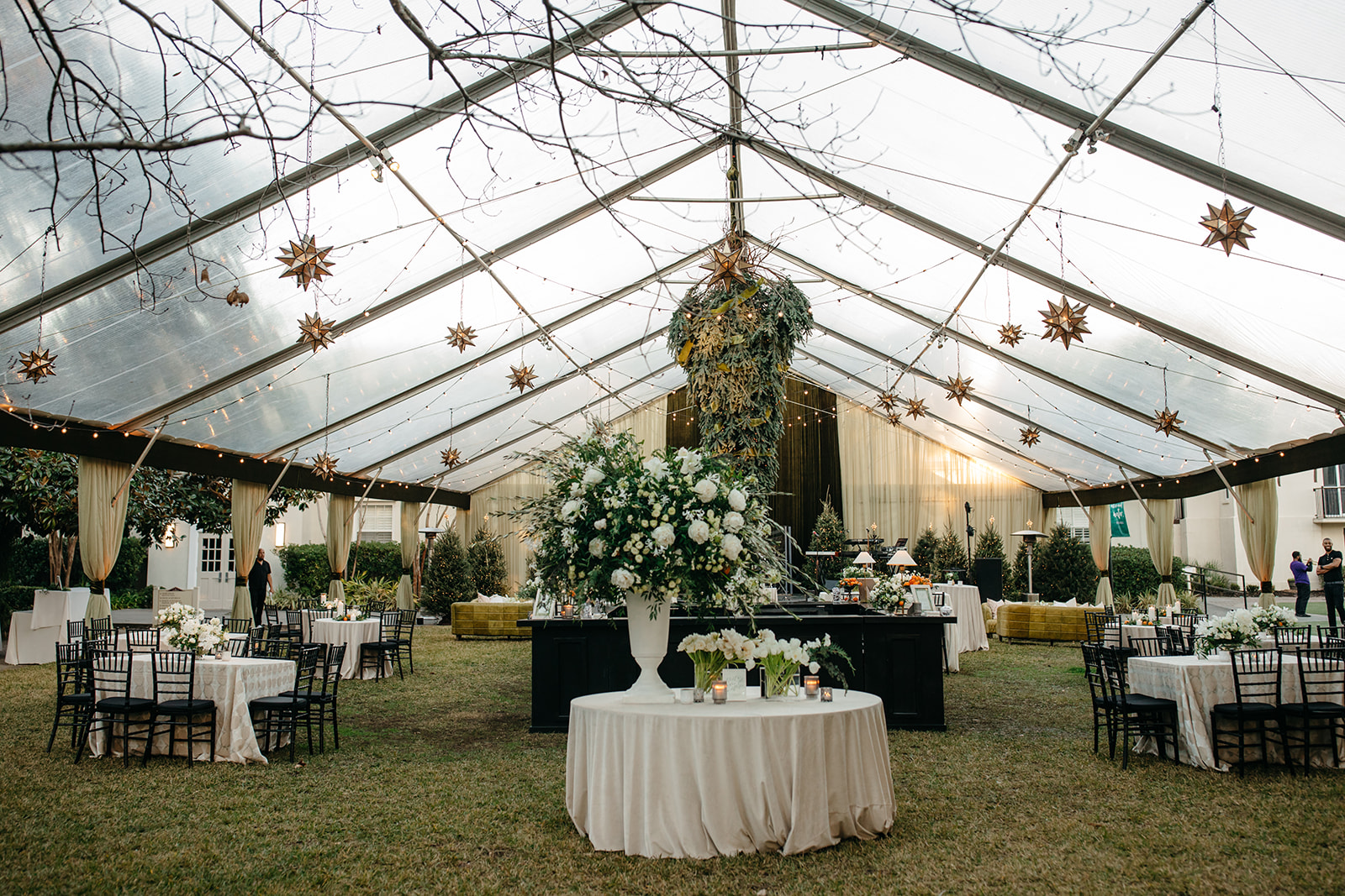
Blank slate venues are neutral spaces like tents, barns, industrial spaces, rooftops, and others where you don’t have to worry about your color palette and design choices clashing with anything already in the space.
On the opposite end of the spectrum are venues that are already decorated—think hotels, country clubs, churches, and even gardens. In these cases, you’ll want to take a look at what décor and colors are already incorporated into the space and use those to determine a complementary color palette.
Regardless of where you’ll hold your wedding, the venue and its décor (or lack thereof) should influence the colors you choose.
THINK ABOUT YOUR WEDDING THEME
Your wedding theme will have a significant impact on your color palette. Your guests should be able to walk into your event and not only recognize the theme but also inherently understand how the colors complement it.
Some wedding themes lend themselves to certain color schemes. For example, it’s no surprise that greens, florals, pastels, and neutrals work well with garden weddings or that monochromatic or bold color palettes are popular at modern-themed weddings.
Once you’ve established a theme for your wedding, you can eliminate colors that would clash with the aesthetic you want to achieve. It’s all part of the planning process.
LOOK FOR INSPIRATION
Don’t just think about your season, venue, and theme! There are lots of places you can look for inspiration when it comes to your wedding color palette:
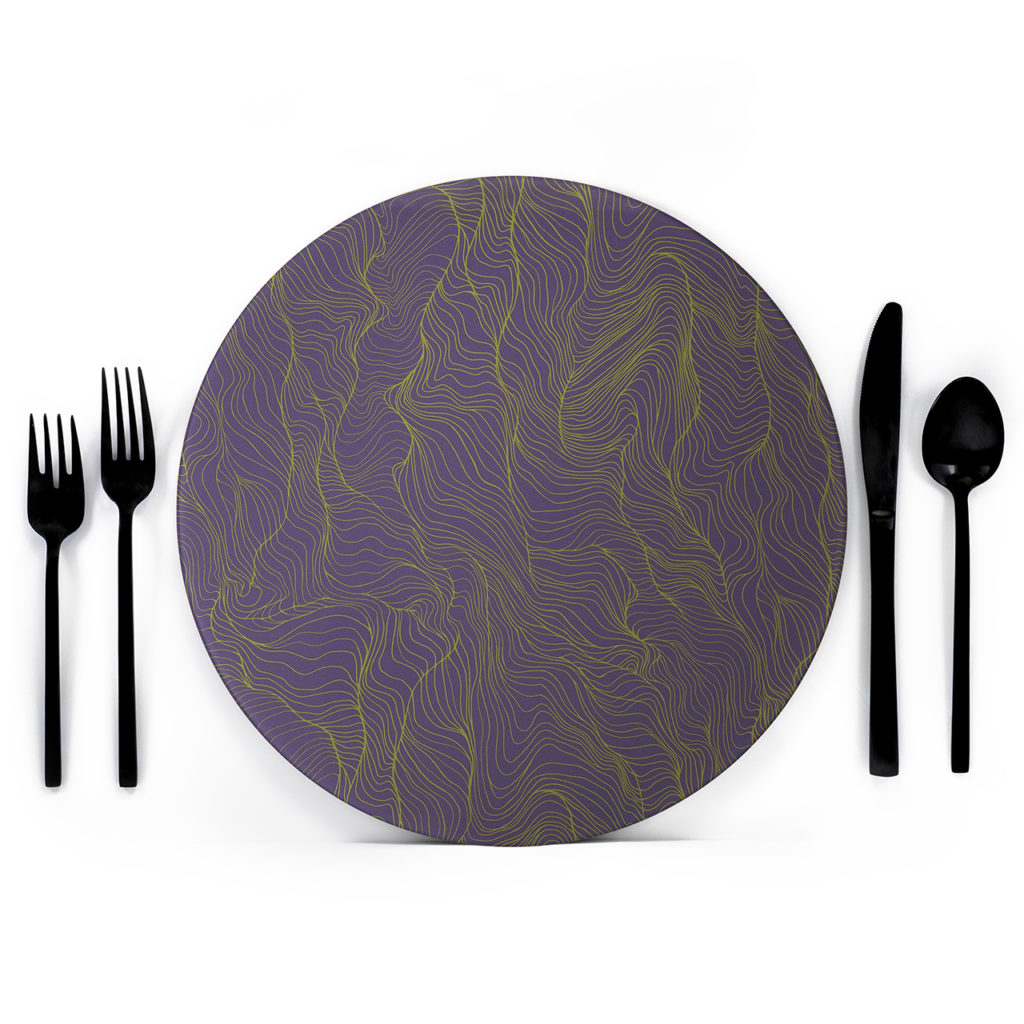
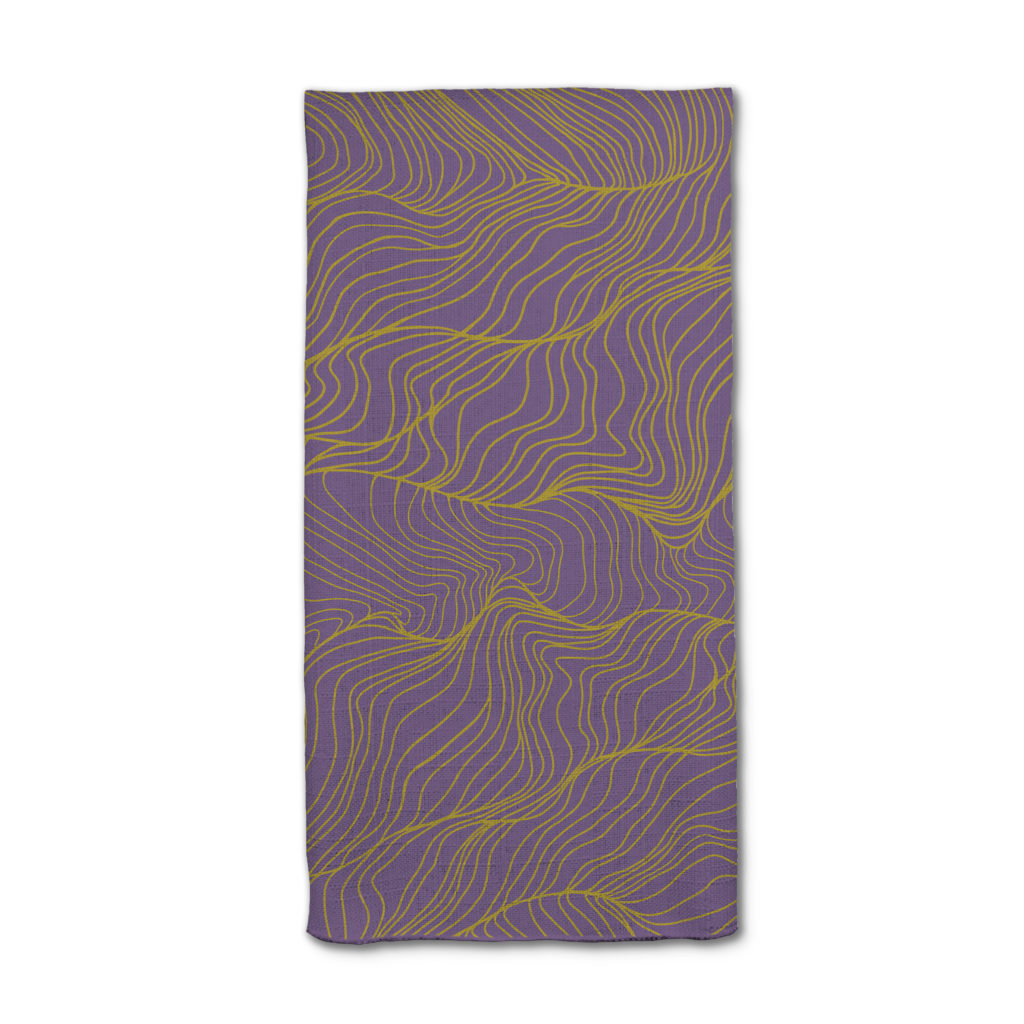
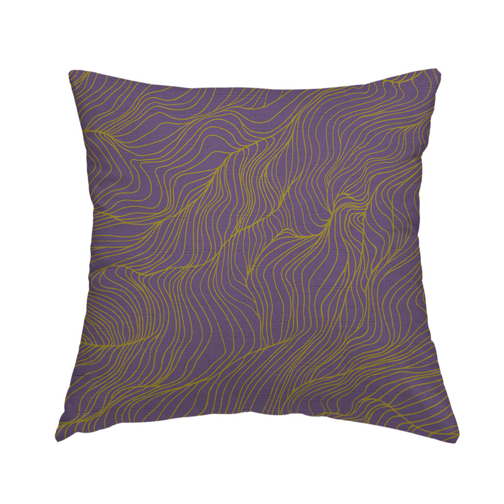
- A print or fabric
- Fashion collections
- Artwork
- Hotel or home décor
- A landscape
You can also reach out to the experts. Florists, wedding planners, photographers, artists, and any color afficionados in your life may be able to help you find wedding colors that speak to you and your story.
CHOOSE A BASE COLOR
Now that you’ve thought about your wedding season, venue, theme, and other sources of inspiration, it’s time to choose a base color.
Your base color can be any color, depending on the aesthetic you want to cultivate. It will be the color that is displayed most prominently—in your décor, your attire, your flowers, etc.
Our best advice: Choose a color you love!
SELECT ACCENT COLORS
After you’ve selected a base color, choose accent colors that work well with it. These complementary colors— at least two or three that work well with your base color—will add variety and dimension to your color palette.
There are endless options. You can add neutrals like black, white, beige, or gray; look at the opposite end of the color wheel to find a contrasting hue; or even incorporate various shades of the same color.
Don’t be afraid to be a bit selfish here, too. You’ll be surrounded by these colors on your wedding day. Think about using the colors that are most flattering to your skin tone.
Have you chosen a base color and selected a few accent colors? Well, there you have it: Your wedding color palette is ready to use!

12 POPULAR IDEAS FOR SPRING AND SUMMER WEDDING COLOR PALETTES
There are endless options for spring or summer color schemes, so much so that it can easily get overwhelming. Use these popular ideas for warm weather color palettes to get started.
1. QUINTESSENTIAL COLORS OF SPRING AND SUMMER
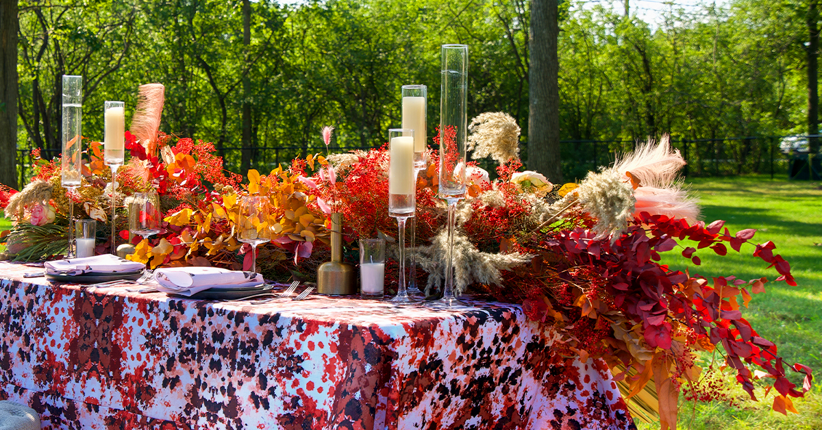
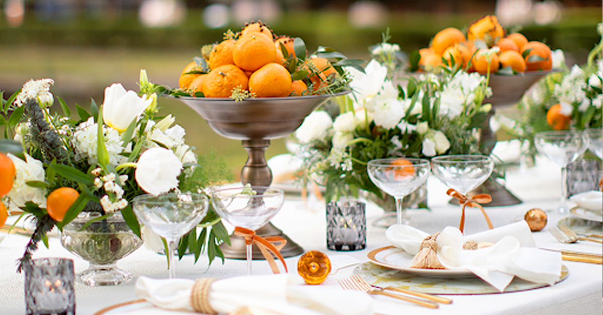
Look to nature to get inspiration for your wedding color palette. The spring and summer months are overflowing with color of all kinds, from the bright purples and yellows of blooming flowers to the burnt orange and rusty red of the desert hills. Green trees, natural sunlight, and sandy beaches can all serve as inspiration for your color scheme.
After all, there’s no better decorator than Mother Earth herself.
2. A TOUCH OF THE UNEXPECTED
Pairing seasonal colors with the unexpected creates an aesthetic that won’t fail to catch the eye of your guests. If pastels are all the rage for spring wedding color palettes and bright colors are popular when it comes to summer wedding colors, why not think outside the box and throw in an entirely new color?
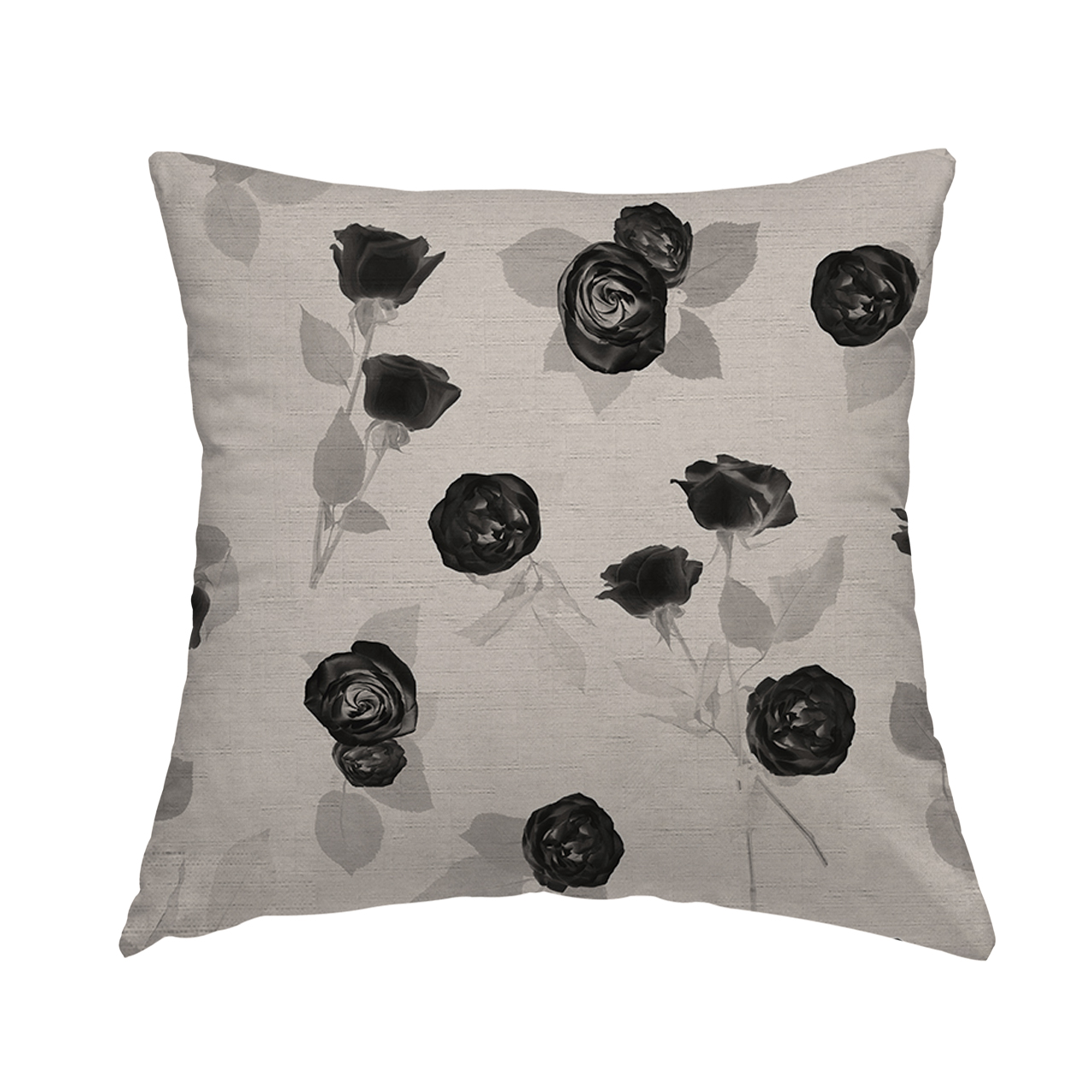
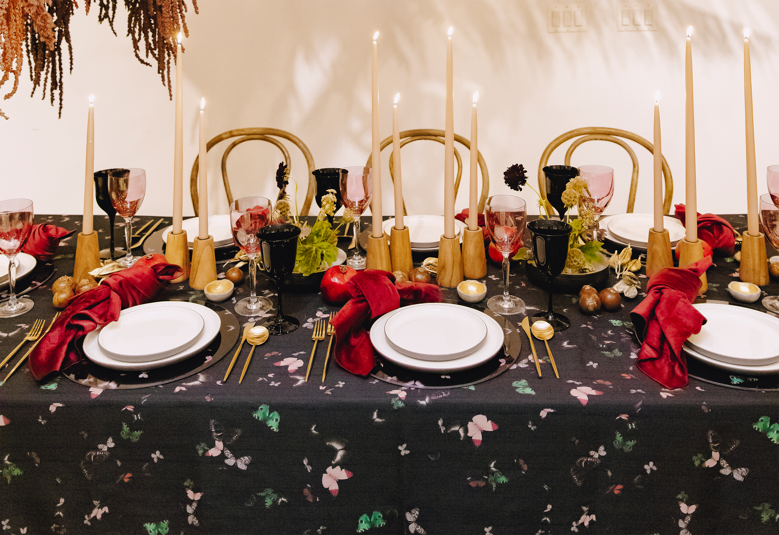
Adding a touch of unexpected color will set your wedding apart from the rest. Black is rarely used in warm weather décor, so just a touch of charcoal will draw the eye. Similarly, adding a contrasting pop of color to whatever color palette you choose will create a fresh look.
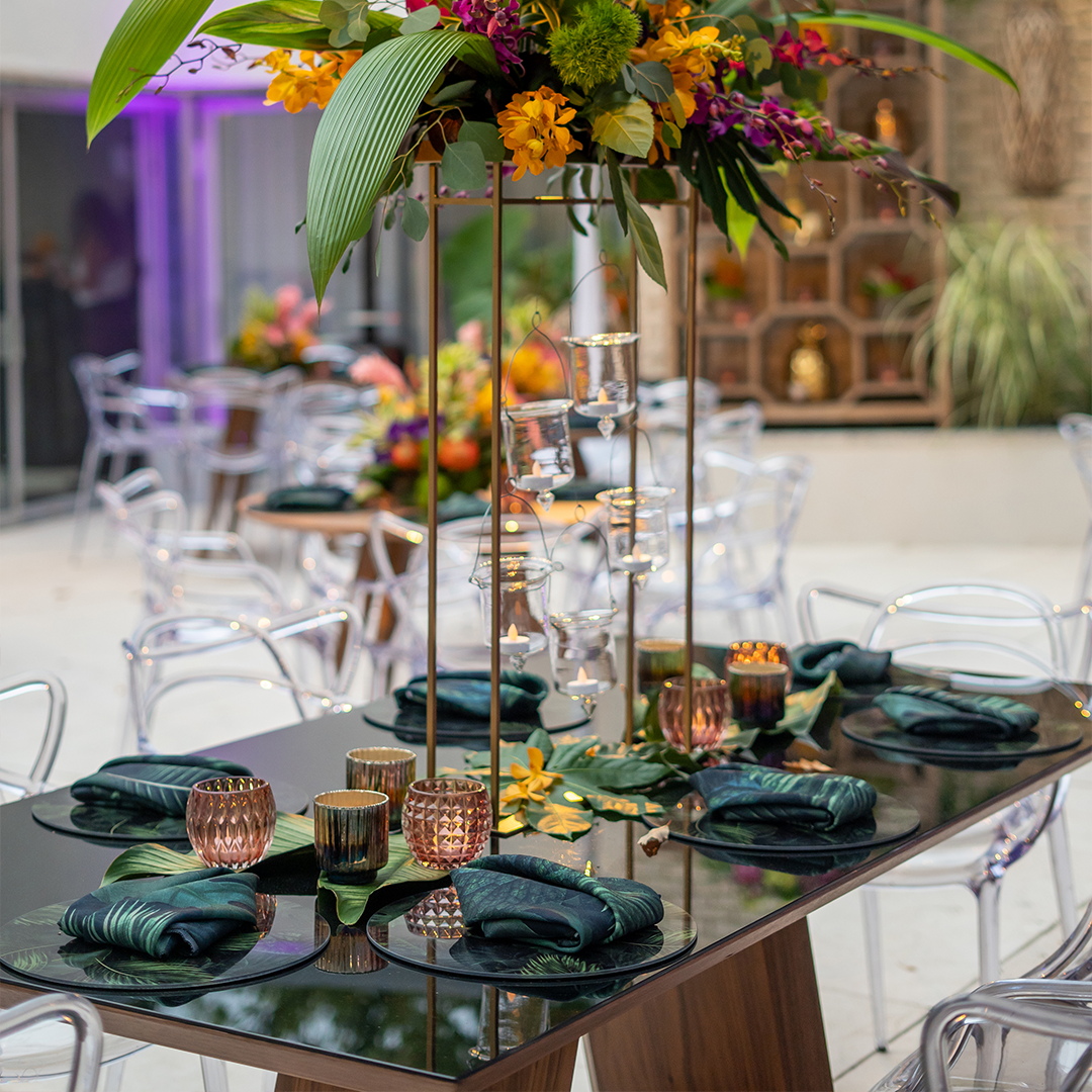
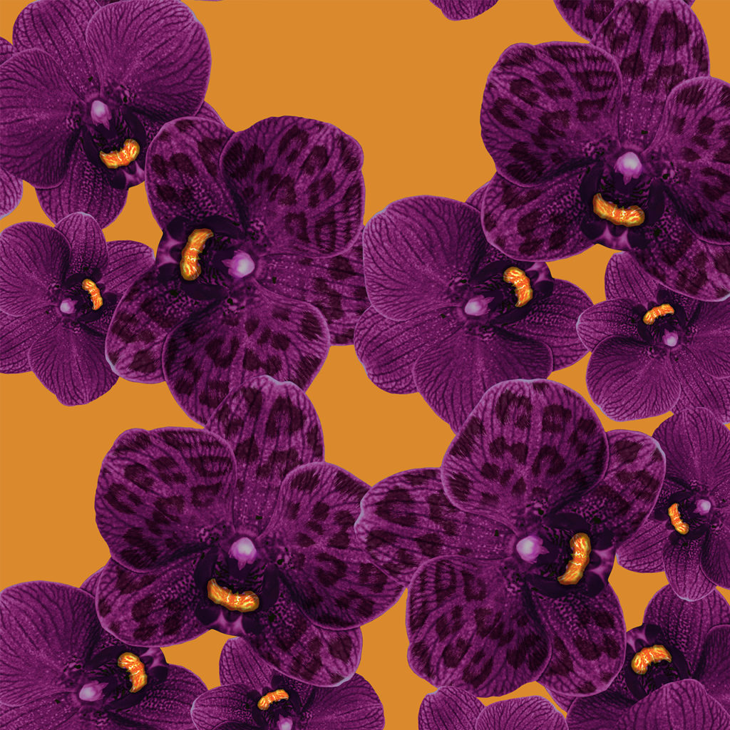
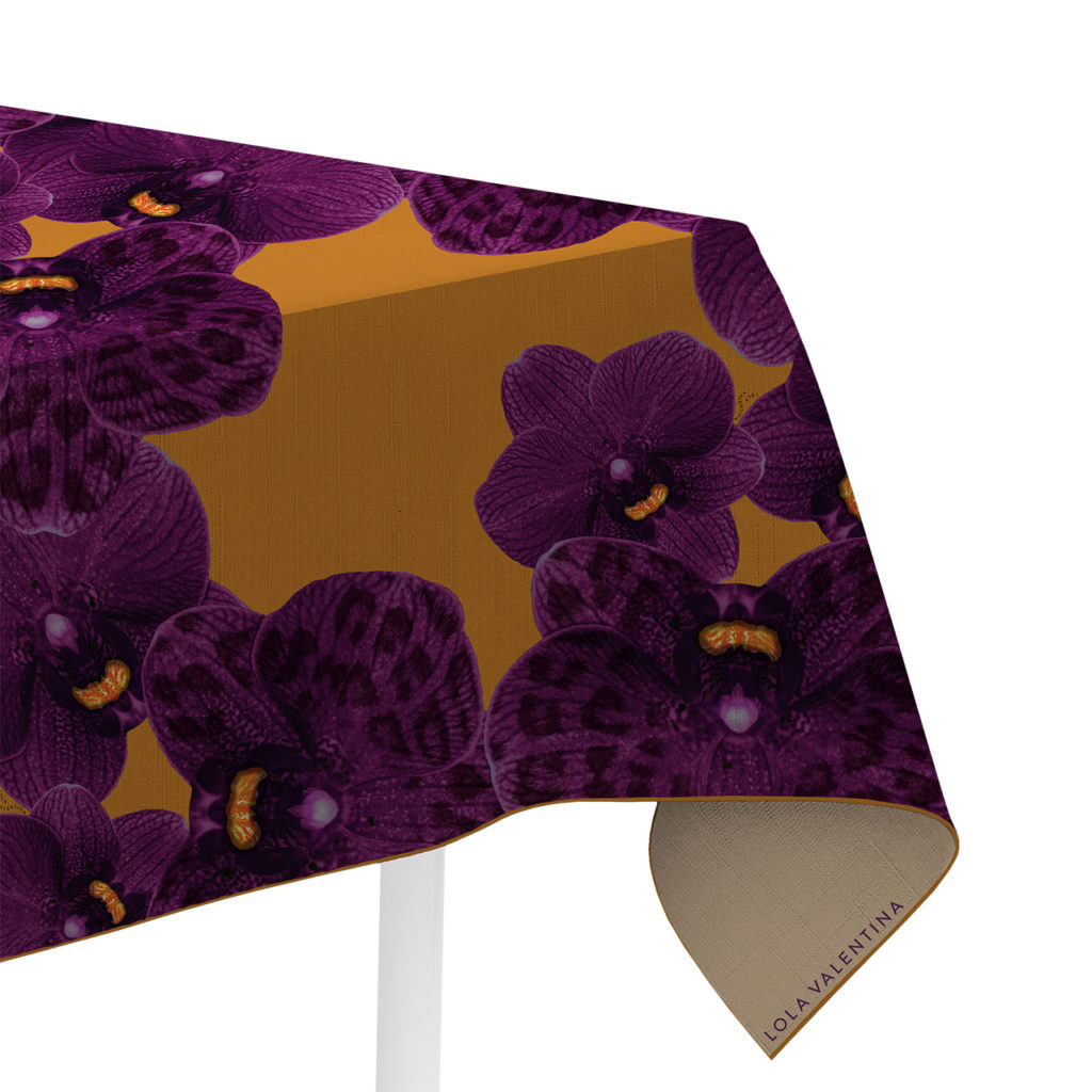
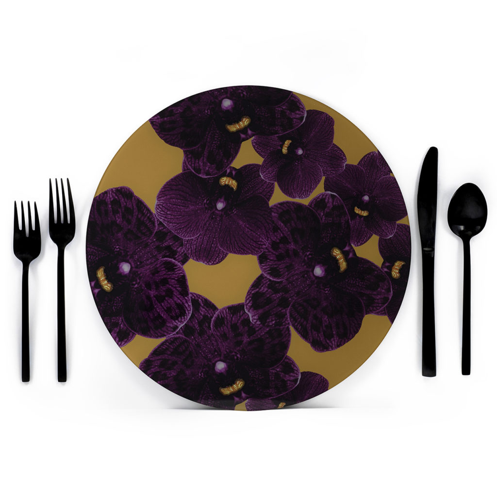
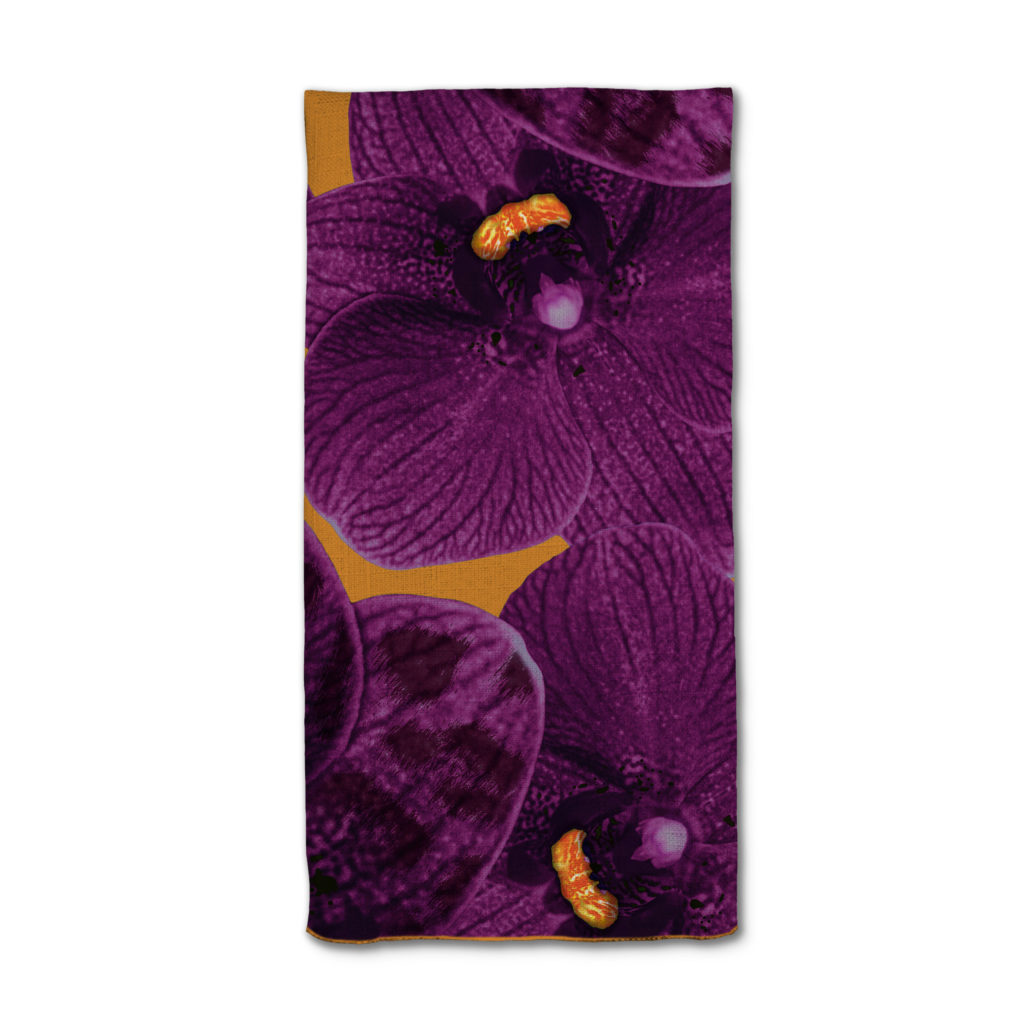
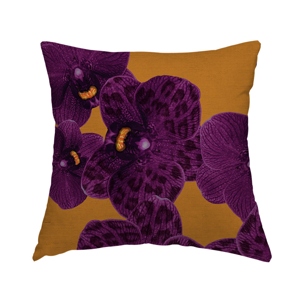
3. JEWEL TONES
While they may be more popular in autumn weddings, jewel tones are an edgy and modern choice for a spring or summer wedding color palette.
You could use bold jewel tones to match the bright florals of the warmer months to create an elegant look, or you can incorporate soft jewel tones to upgrade classic pastel hues. Either way, you’ll create something new.

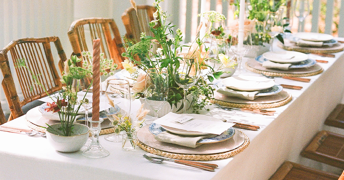
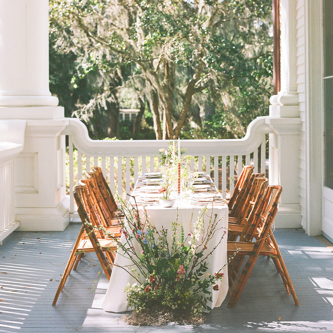
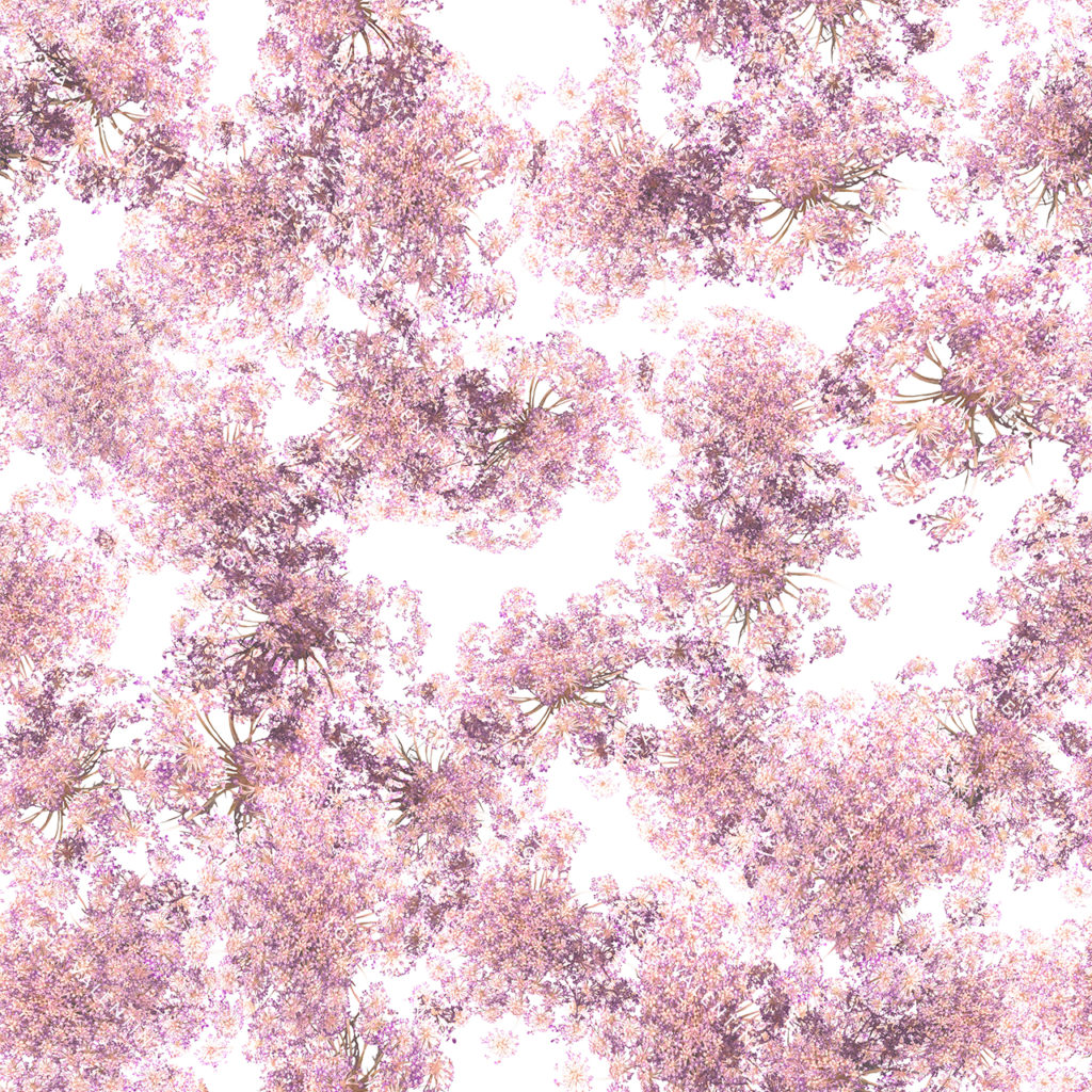
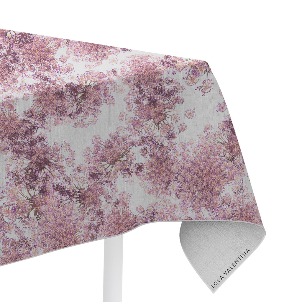
4. SPRING FLORALS
April showers bring May flowers, and spring weddings color schemes should take advantage of them. Put those florals on display with earth tones or a red-and-blush color palette. A simple walk through a flower market or botanical garden will provide you with unlimited inspiration for spring wedding colors.
5. SUMMER SUNSETS
There’s nothing quite like watching the sun splash color across the summer sky as it sinks over the horizon. Use the pinks, yellows, oranges, and purples of summer sunsets to bring life and warmth to your summer wedding colors.

6. MONOCHROME
Instead of choosing several hues to make up your wedding color palette, you can explore a variety of shades of one color to create a sharp, elegant aesthetic.
A monochromatic color scheme, with both dark and light shades of a single base color, is a unique choice that is perfect for minimalist wedding celebrations. Play with tones of green, purple, black, or red—there’s something for everyone.
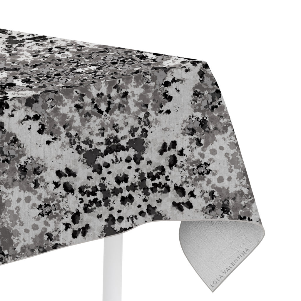
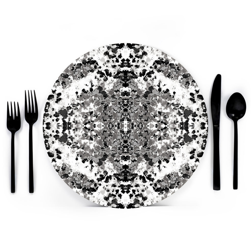
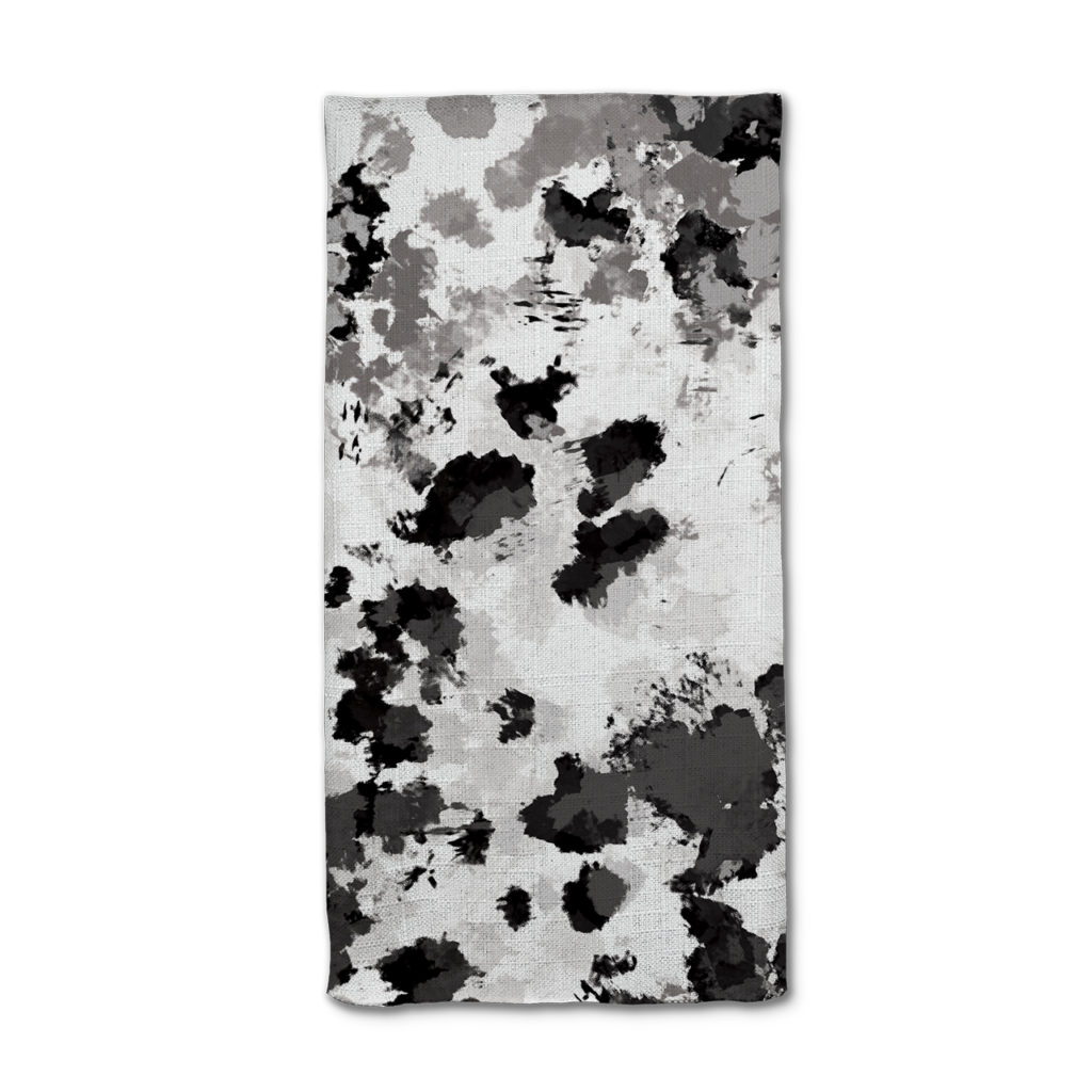
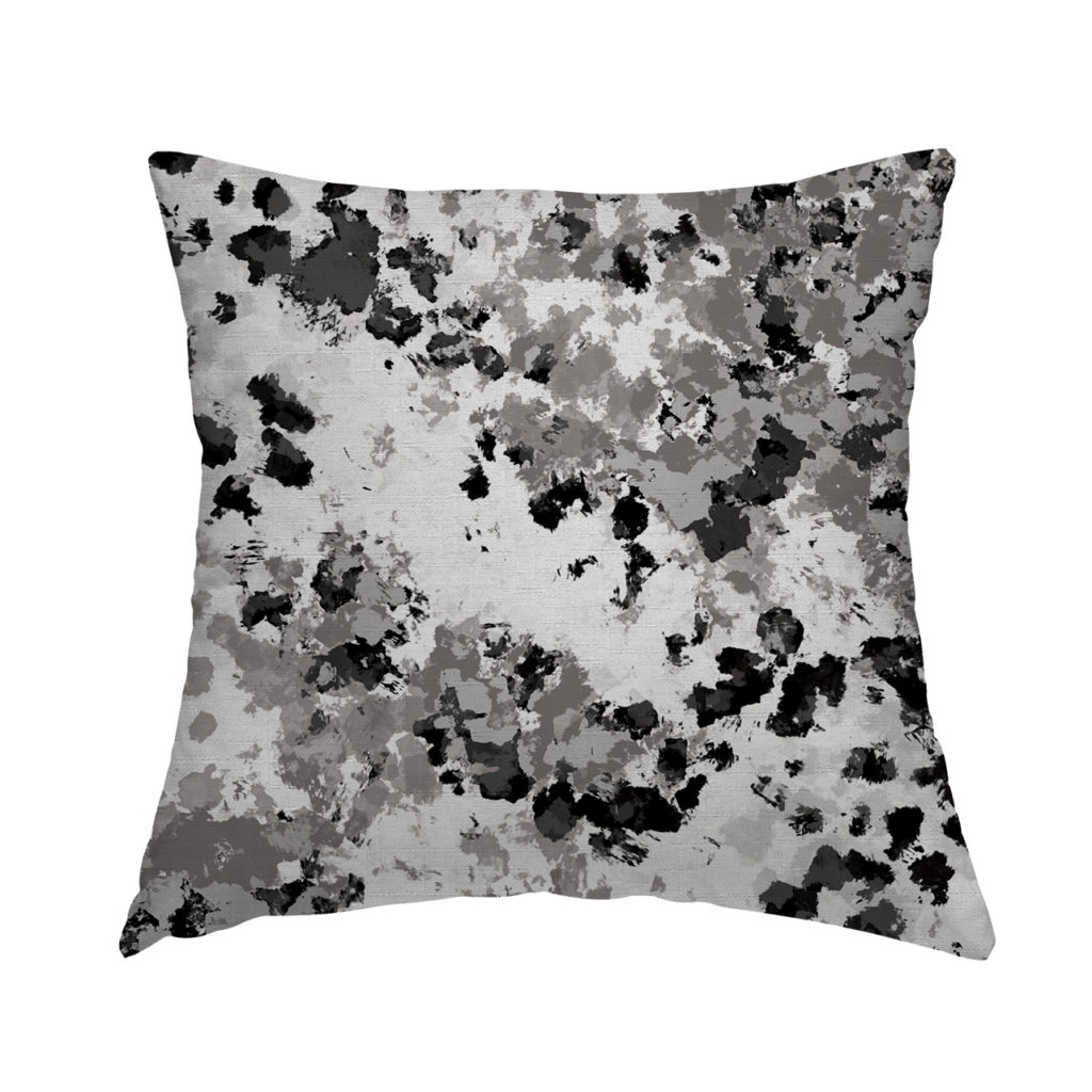
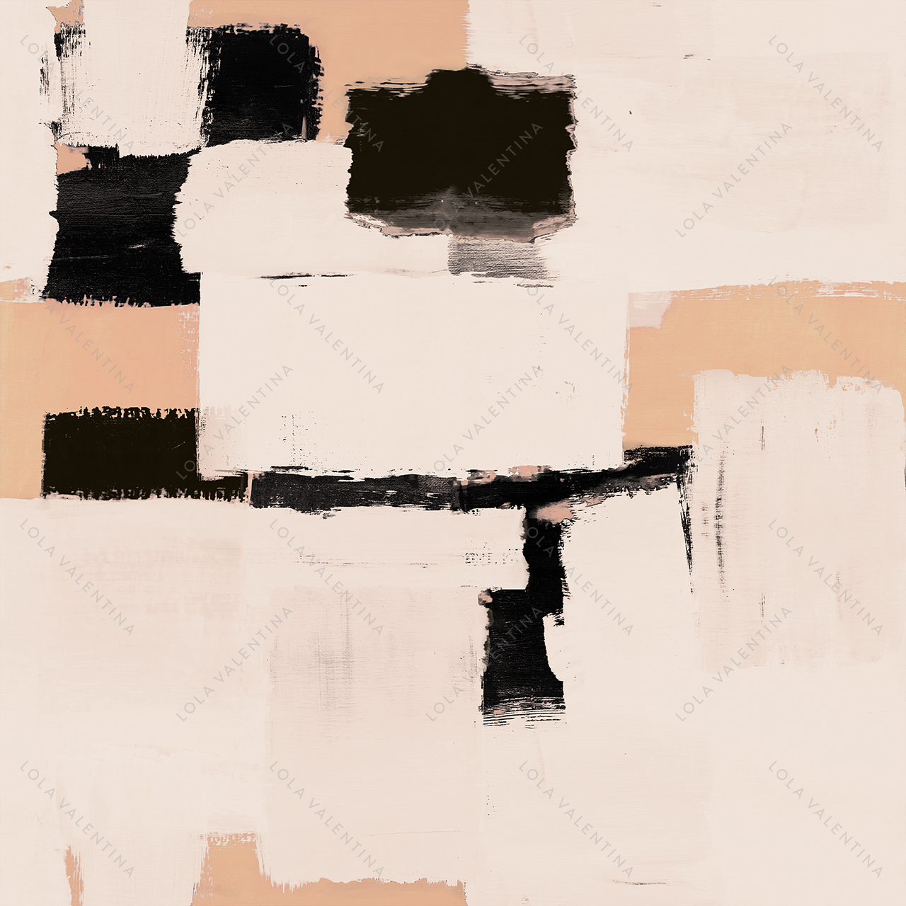
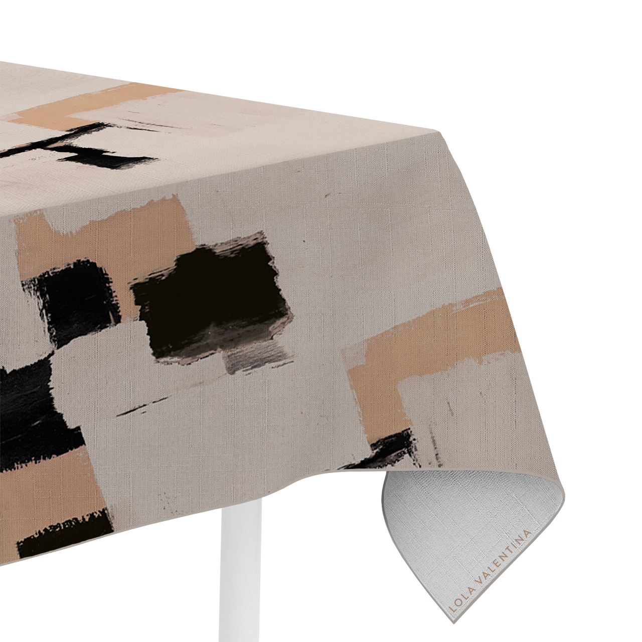
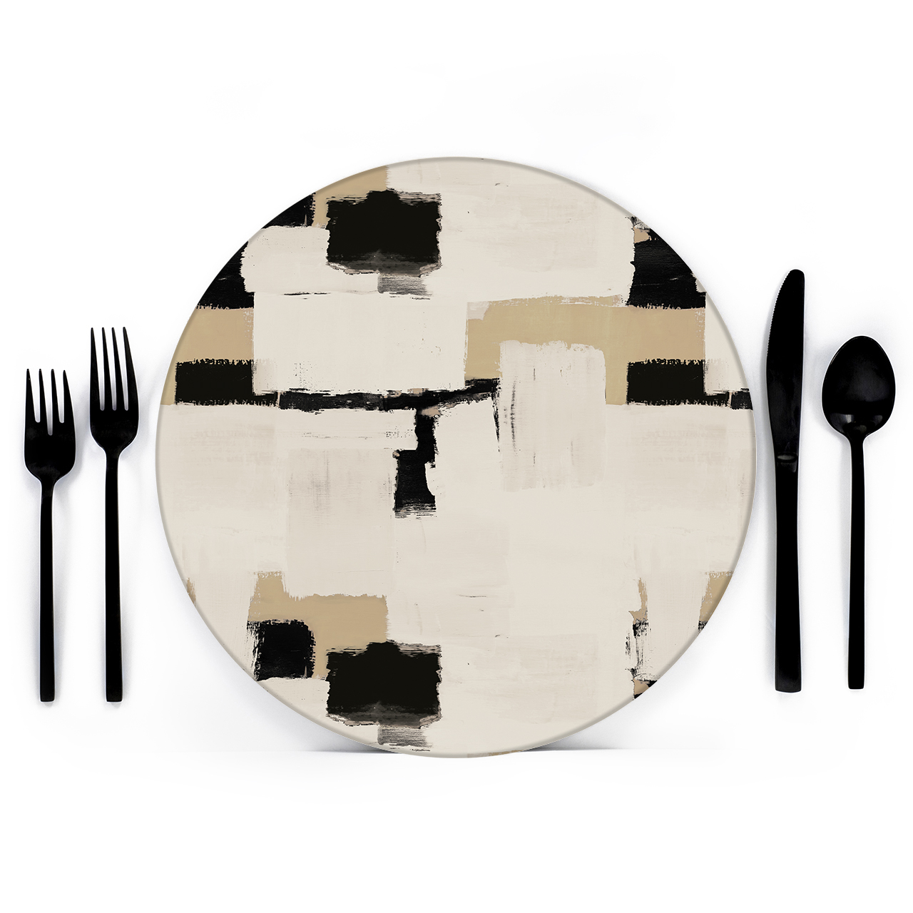
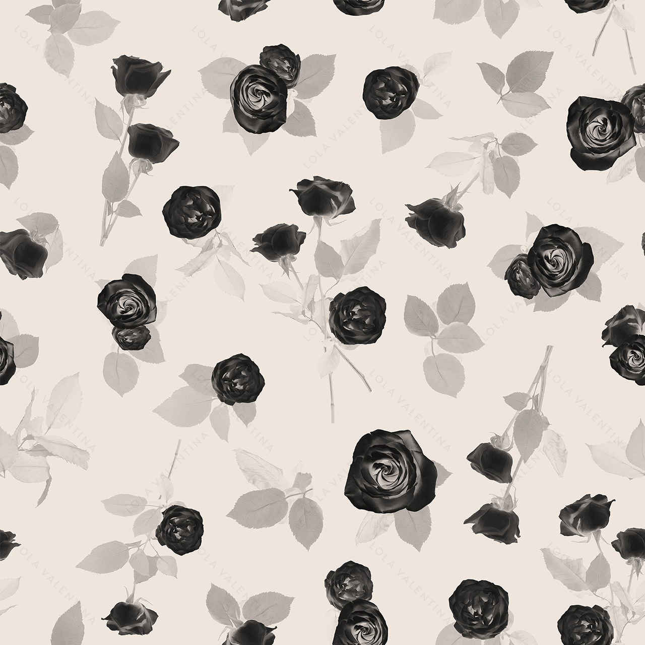
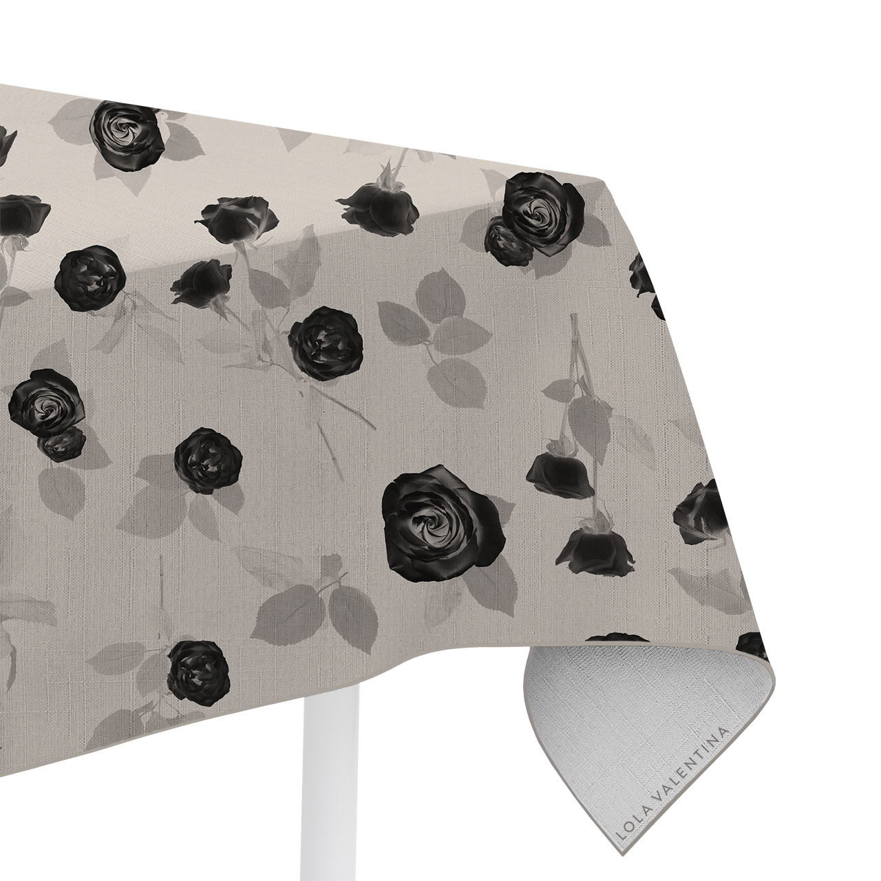
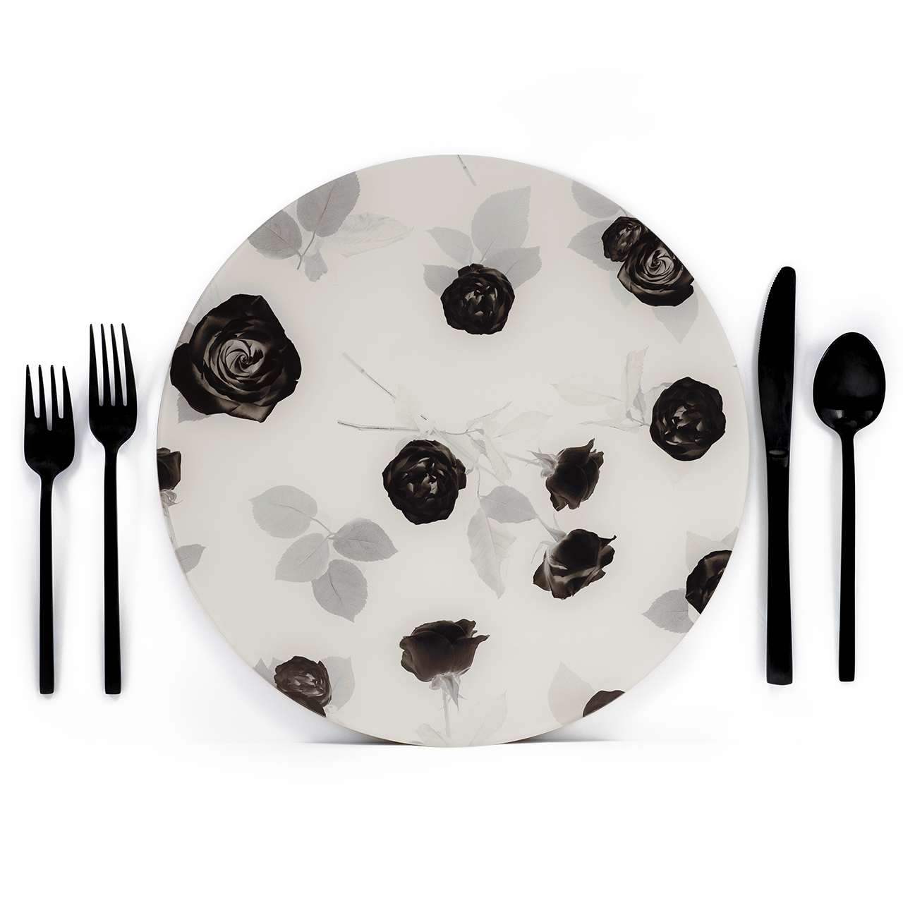
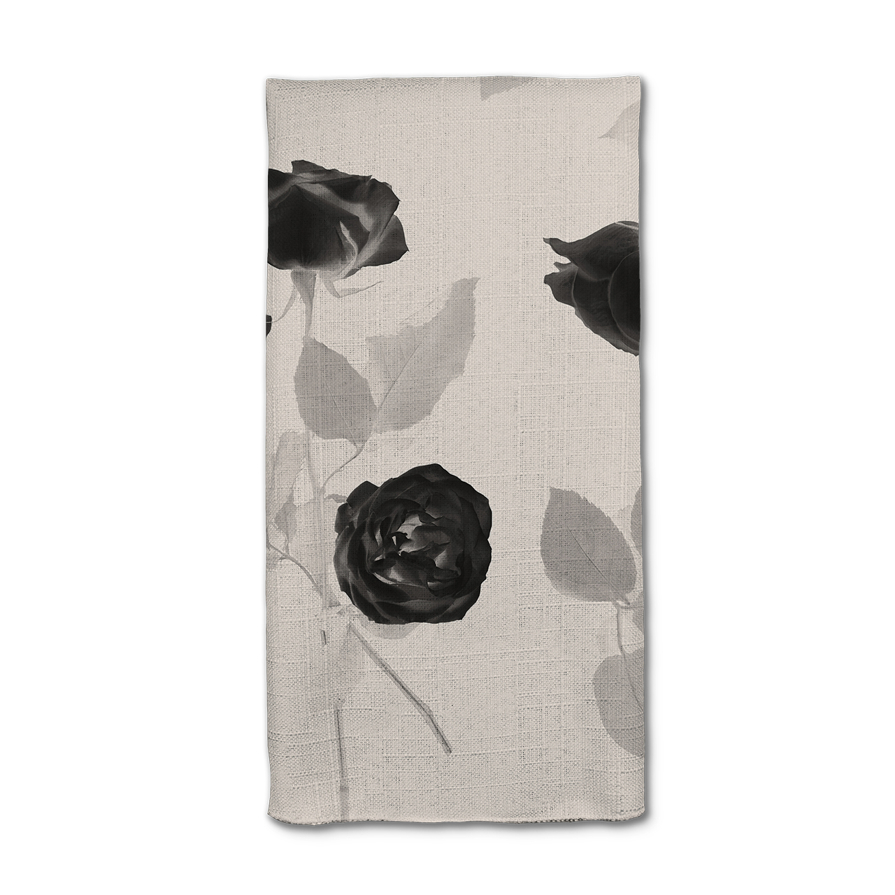
7. BLACK AND WHITE
Black and white is classic for a reason: It’s a foolproof wedding color palette, even during the spring and summer months. However, we’re moving past the constricting feeling of these two colors alone and instead making them naturally flow from one to another by adding grays and metallics to create a dynamic look.
Don’t discount the power of adding a pop of color, neutral shades, greenery, and textures to take black-and white from old to new.
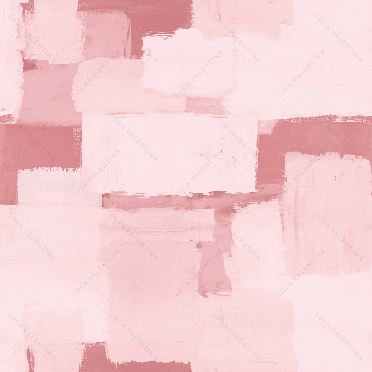
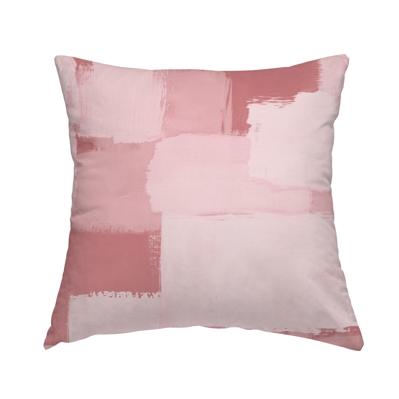
8. PASTELS
The warmer spring and summer months are bursting with pastels, so it’s no surprise that pastels are a popular choice for wedding color palettes. There’s no need to start from scratch here, because these colors are always a great choice, but you can freshen things up by muting or darkening these hues slightly to add just a touch of the unexpected.
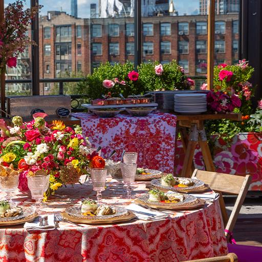
9. PRIMARY COLORS
Red, yellow, and blue are the basis of the color wheel. Together, they make up every other color our world has to offer. So, if you’re looking to make a bold statement, consider starting with primary colors.
You’re not limited to the purest blue, red, and yellow, either. Add variety by incorporating different shades and textures to give the design aesthetic of your wedding some visual depth and drama. Blue can turn into navy, yellow into gold, and red into maroon. Then, you can use the base primary colors to tie everything together.
10. SECONDARY COLORS
Following primary colors, the next part of the color wheel to consider is the secondary colors: orange, green, and purple. You can combine these hues to create an unexpected but stunning color palette.
Don’t forget those shades! For green, look into mint, sage, pistachio, and forest. For orange, try amber, peach, coral, or rust. For purple, there’s lavender, violet, indigo, lilac, and mauve.
These colors lend themselves especially well to natural, outdoor events.
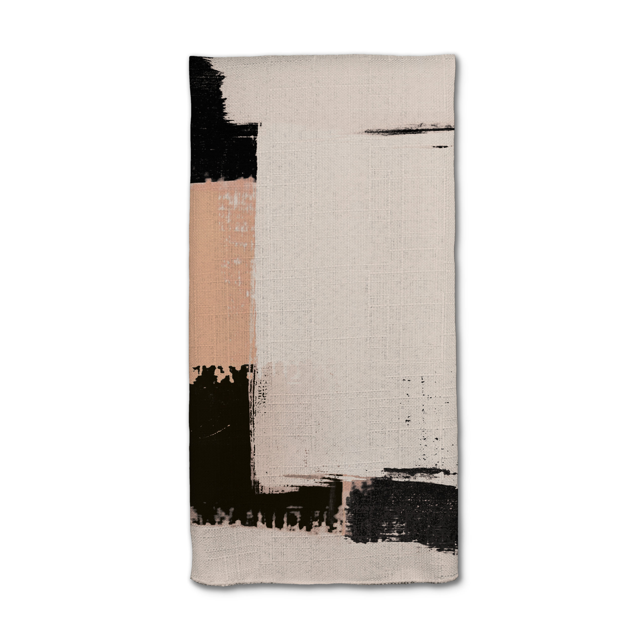
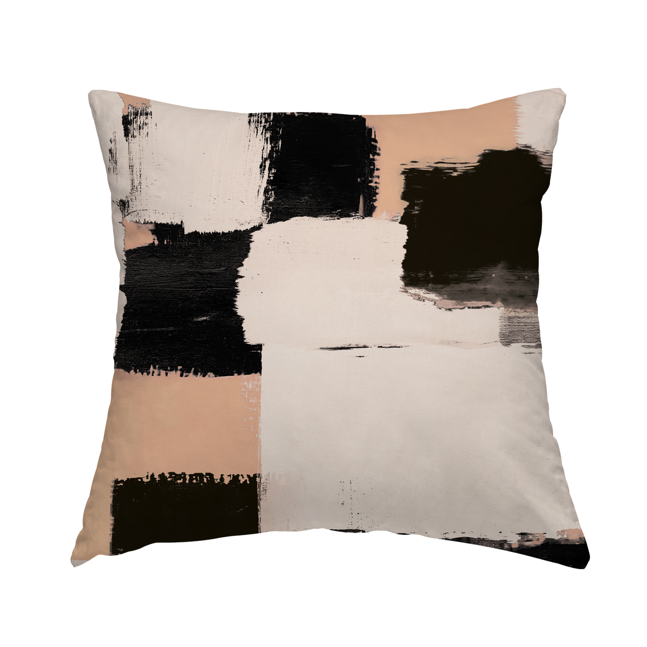
11. NEUTRALS
A neutral color palette creates a sense of elegance and brings to mind a light, bright atmosphere for your guests. These colors allow organic elements to shine, incorporating both florals and greenery as well as other elements from the natural world.
Creams, whites, greens, browns, and beiges are popular neutral wedding colors. The key to pulling off a neutral color scheme, though, is texture. By adding lots of textural variety, you create depth in your design—an eye catching quality that will mesmerize your guests.
12. TECHNICOLOR
It’s your wedding. If you can’t decide on a traditional color scheme, you don’t have to! Pick and choose your favorite colors and shades until you find a combination that works for you.
The important thing to remember when creating a technicolor palette is that balance is key. Use neutrals, blacks, and grays to break up spots of bright color. Similarly, mix in pastels to soften bold décor choices.
As long as your color choices work well together and speak to your personal preferences, you can’t go wrong.

WHERE TO USE YOUR SPRING AND SUMMER WEDDING COLORS
Once you’ve established your spring wedding colors or summer wedding color palette, you’re ready to start incorporating them into every facet of your wedding, from the big picture to the smallest details.
Here are some ideas for where to add color to help you get started:
- Wedding party attire
- Floral arrangements
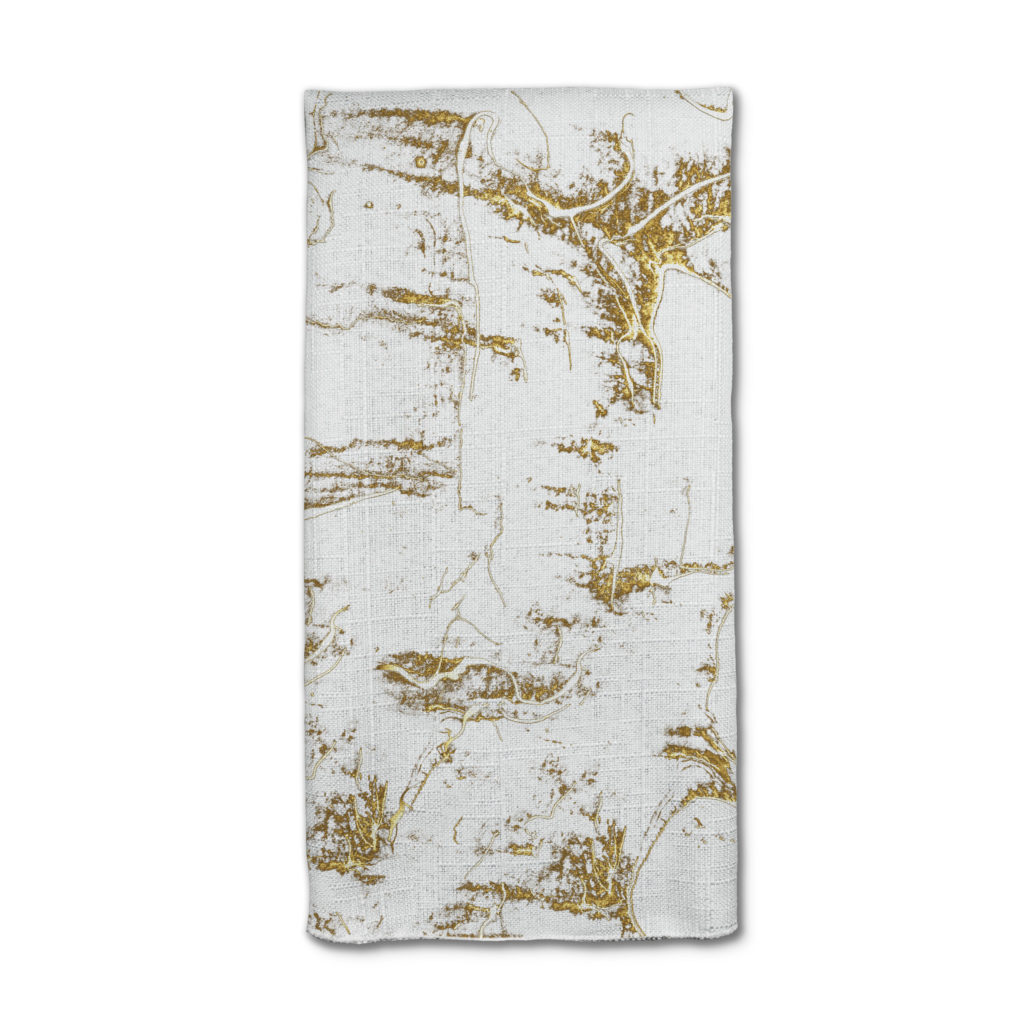
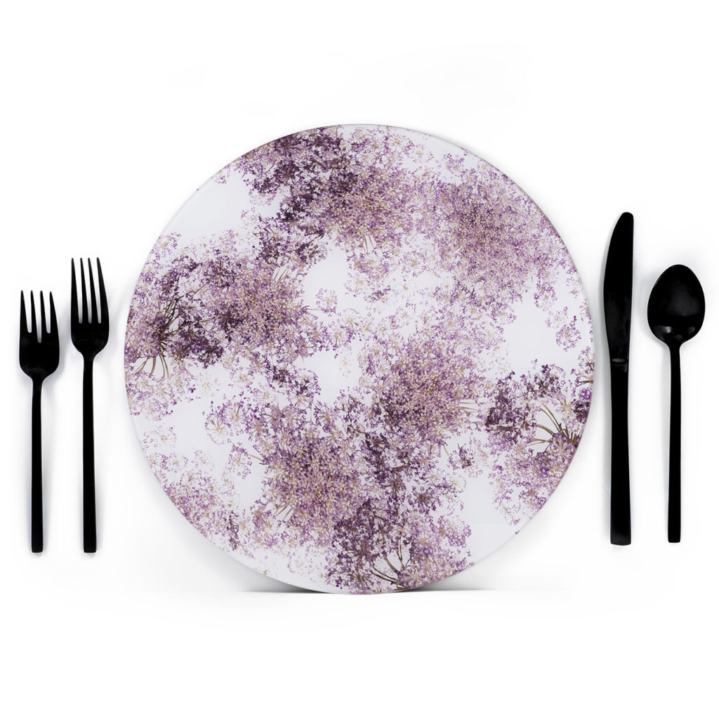
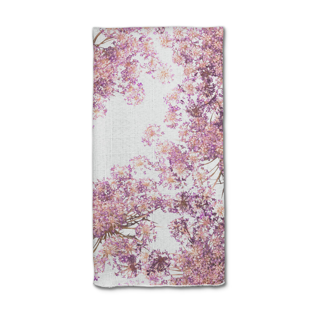
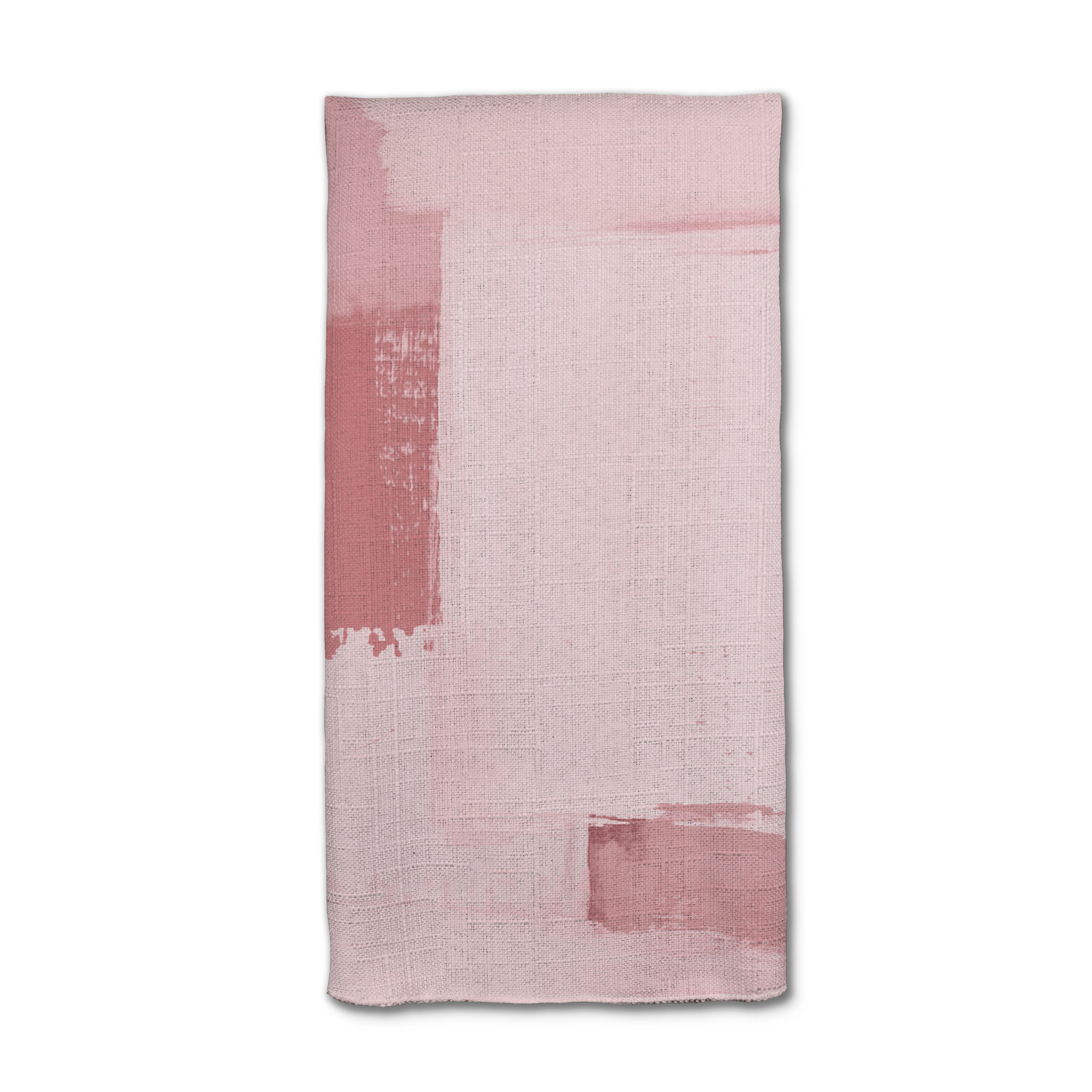
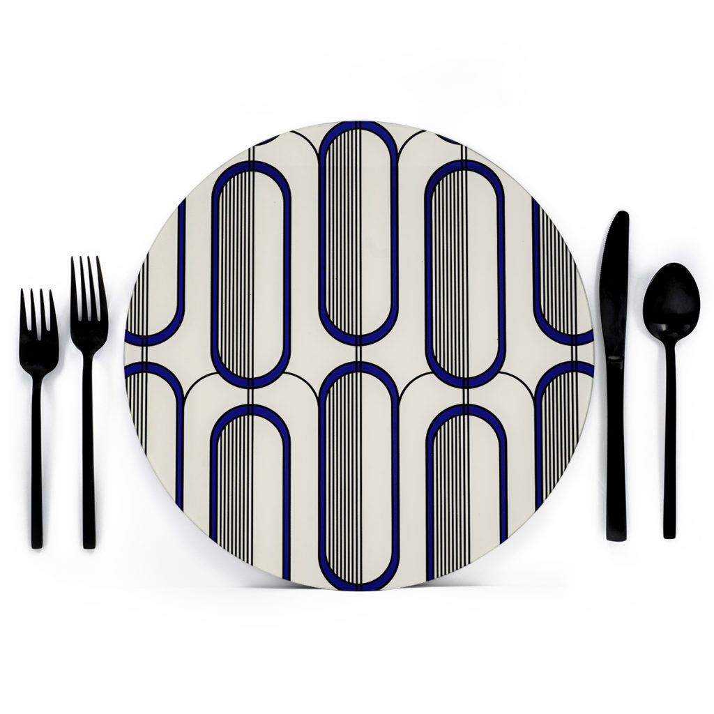
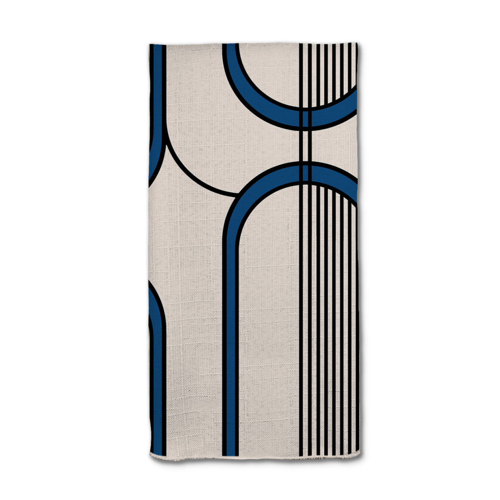
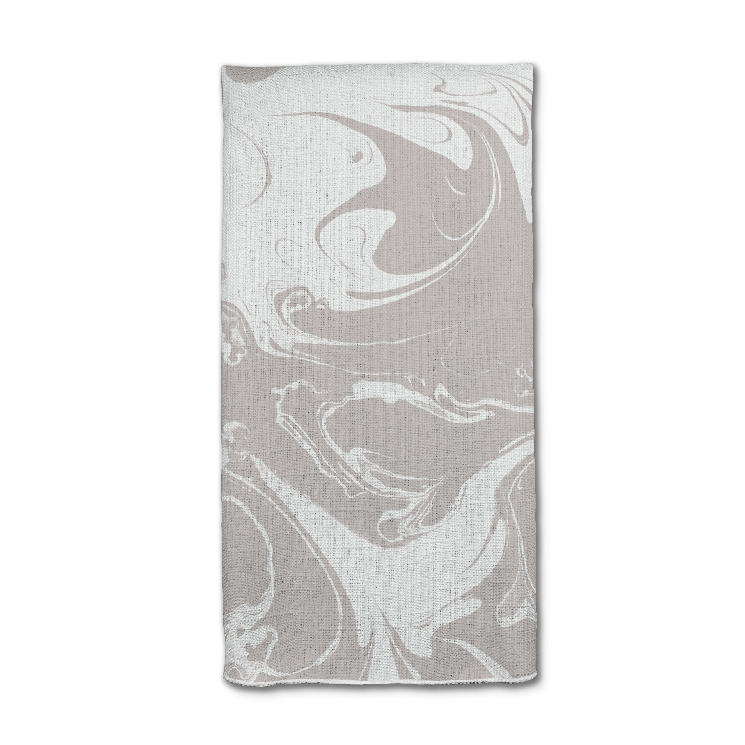
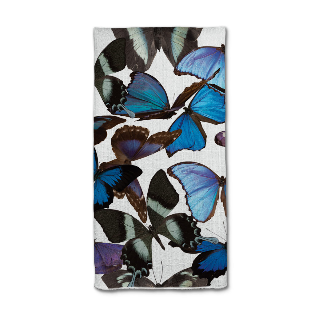
- Napkins
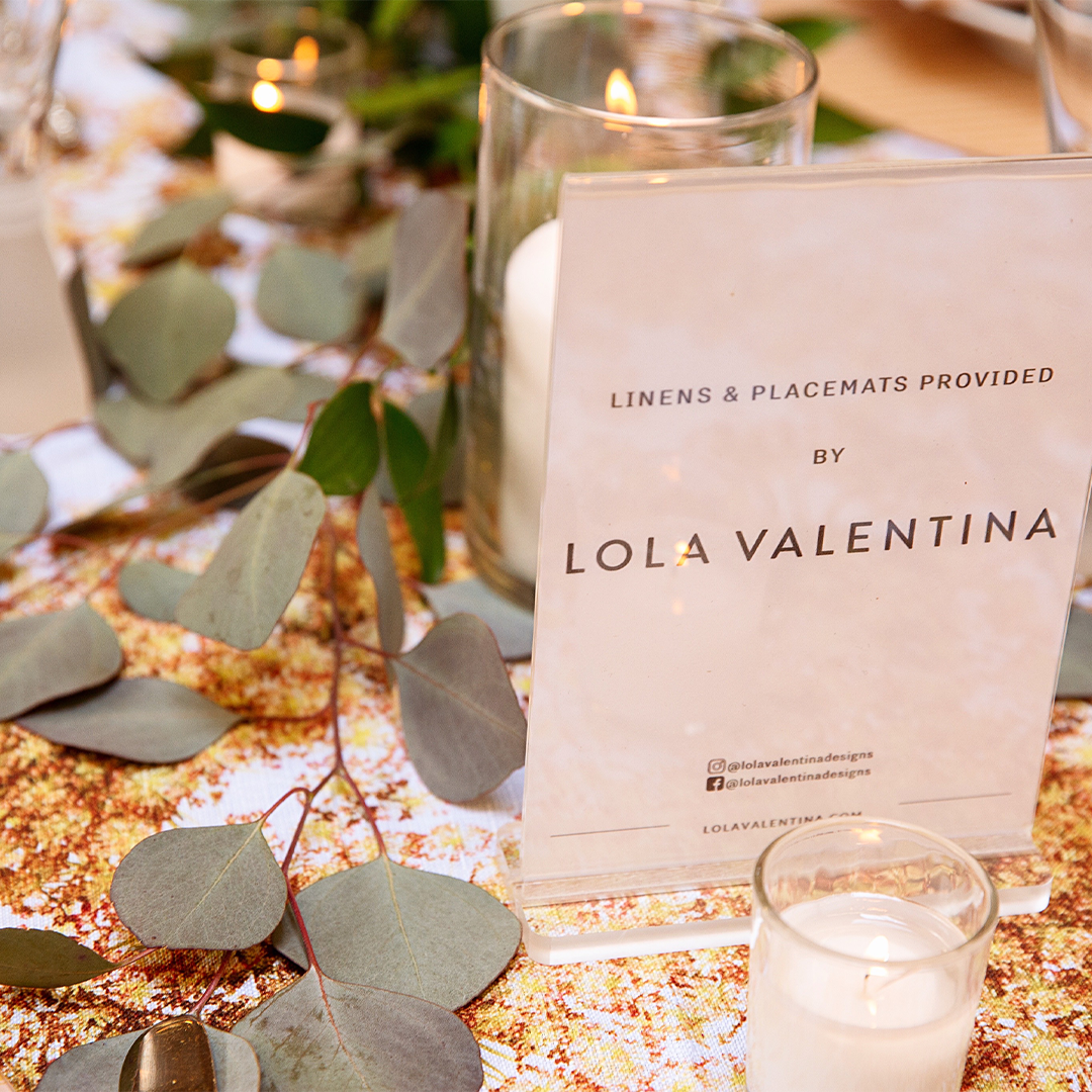
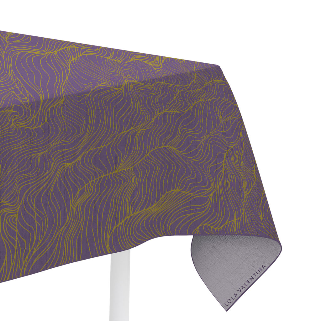
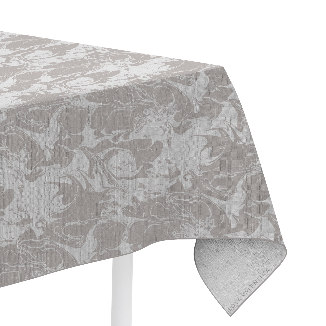
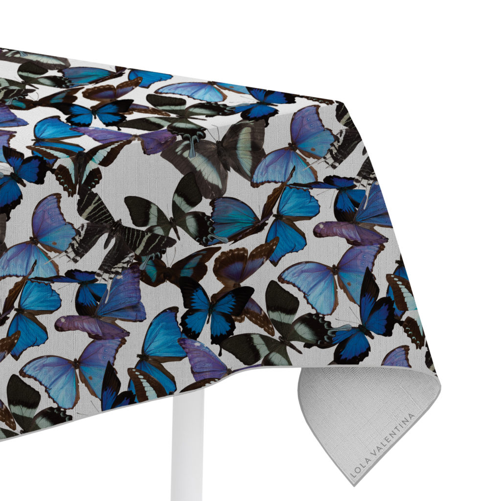
- Table linens and runners
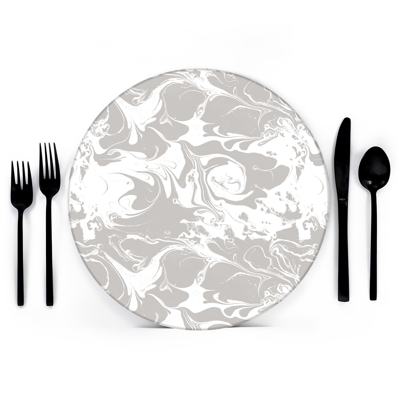
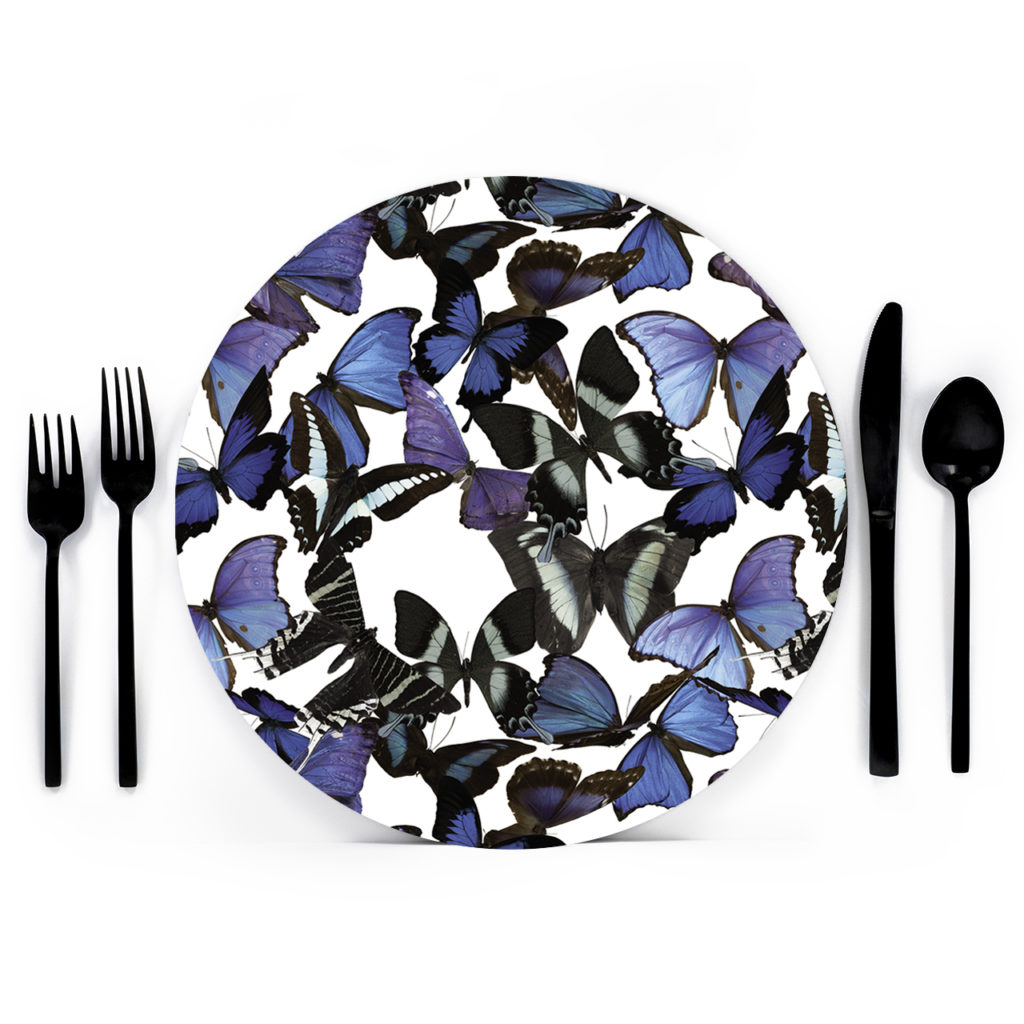
- Glassware
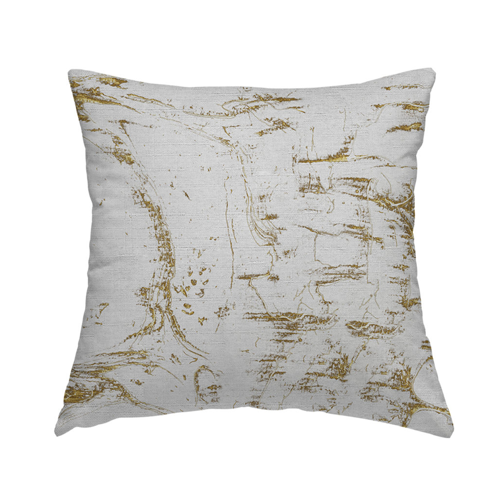
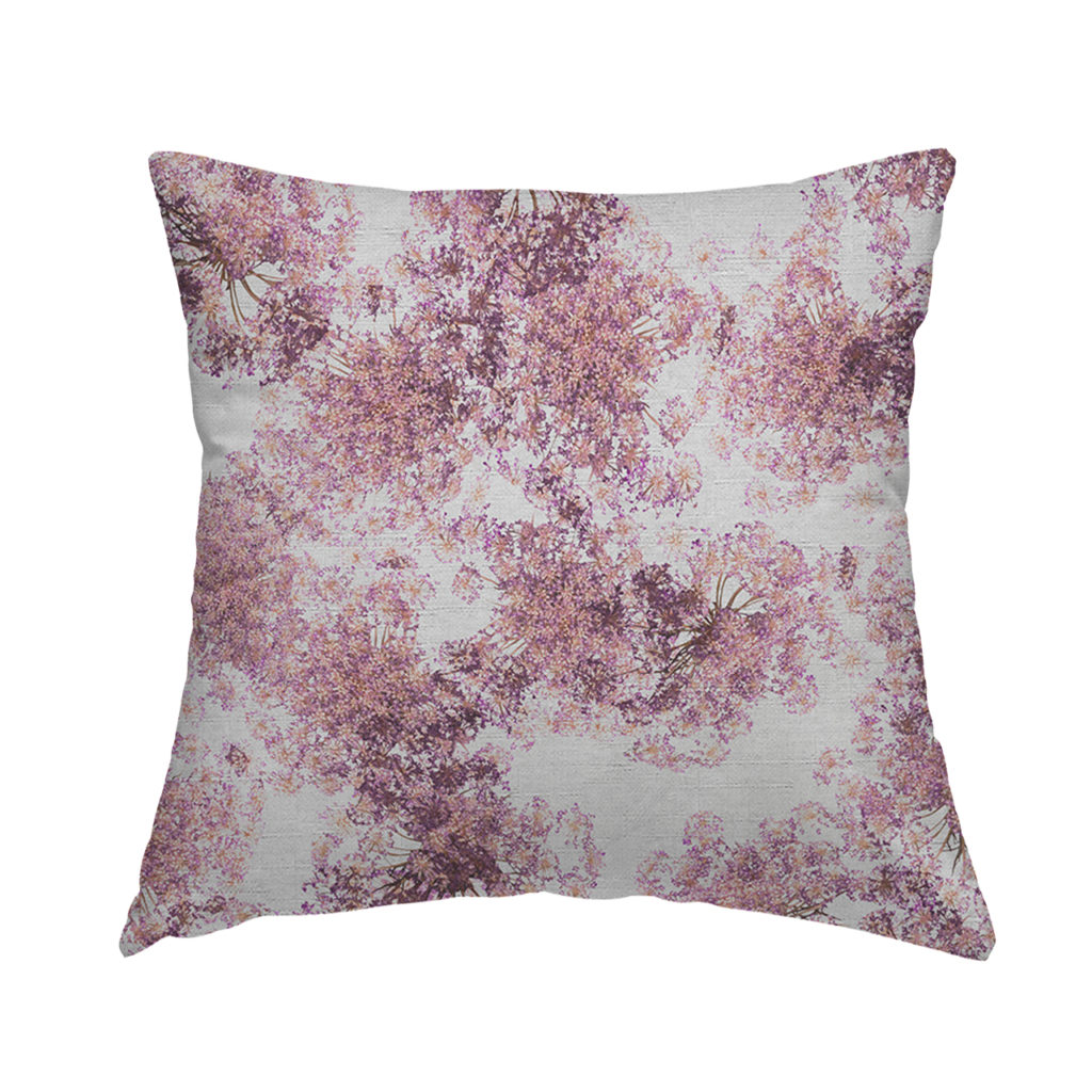
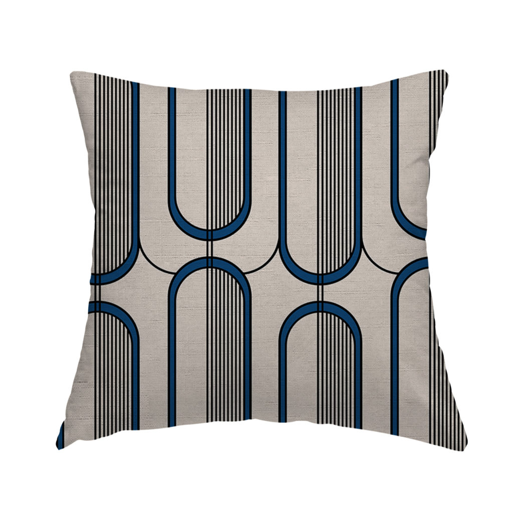
- Decorations
- Drapery
- Invitations
- Lighting
- Ribbons or wrapping
- Food or cocktail themes
Whether you have built a palette around spring florals, summer sunsets, calming pastels, bold jewel tones, or any other color scheme, you can use your wedding colors to tie everything together and create a unique, memorable, and stunning event.